Starting a quote looks more informational than "actionable." Users don't expect to kick off a quoting or purchasing flow by clicking elements in the middle of a web page.
Online-based moving and storage services
UX Case Study
Client Overview:
Clutter is an online-based moving and storage service. Their goal is to shift the experience of moving and purchasing storage space from a primarily offline experience to a primarily online experience.
Problem:
Clutter.com is struggling with their conversion rates.
1. Identify 2 major UX/UI deficiencies with the Clutter online purchasing experience.
2. Define 2 user personas (or user types) who likely won’t make a purchase because of the identified UX/UI deficiencies.
3. Use those user personas (or user types) and identified deficiencies to make UX/UI recommendations for Clutter's purchasing experience that better meet the needs of the identified users.
Project Details:
Project framework as agreed-upon between myself and the client.
Role:
• Lead UI/UX/Product Designer
• UX Researcher
Timeline:
72 hours to complete and demo final deliverables
Tools:
• Adobe Creative Suite
• Figma
Design Process
Start here first. Create a road map of steps tailored specifically to this project.
The steps of this process changes from project-to-project, and oftentimes vary in length. User Research, Journey Mapping, User Surveys, Usability Testing, A/B Testing, and Interactive Workshops are just a few of the methods employed to ensure that meeting the users' needs is kept at the forefront of every project.

Research & Ideate
Identify two major UX/UI deficiencies in the Clutter purchase experience.
This stage begins by viewing the client's existing website and navigating it like a normal user would. Throughout this process notes are taken on the overall website design, information architecture, page flow, user experience, expected actions, and any errors or unexpected issues are documented. Problem areas are then compiled into a group of screenshots, and more detailed notes are formed on issues that need the most UX improvement.
Initial Website UX Thoughts and Observations:

First Major Clutter.com UX Deficiency:
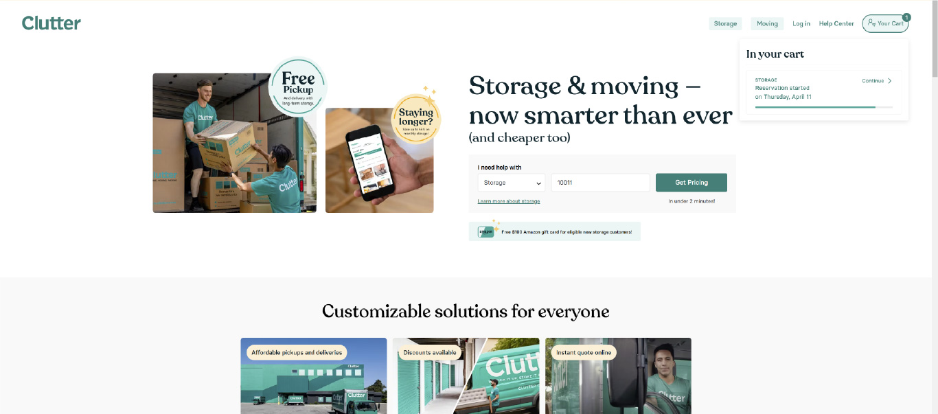
Getting started with a moving or storage quote is too confusing (for a few reasons).
• It’s too easy to miss starting a quote because, it doesn't stand out or look "actionable." This is the most critical aspect of the Clutter website, but unfortunately, it just blends into the rest of the page.
• After a user has added their zip code to begin pricing moving/storage options, it's not obvious that they have been taken to a "new" page to begin selecting their desired products and services. This interaction is confusing for two main reasons.
1. It’s difficult to asses where the user is on the Clutter website since this page is essentially an exact copy of the page before it. The only way for a user to recognize they're in the quoting flow/process is by scrolling vertically, which reveals that you can now begin choosing moving and storage options.
2. The page is very busy, overly-complicated, and it doesn’t flow very well.
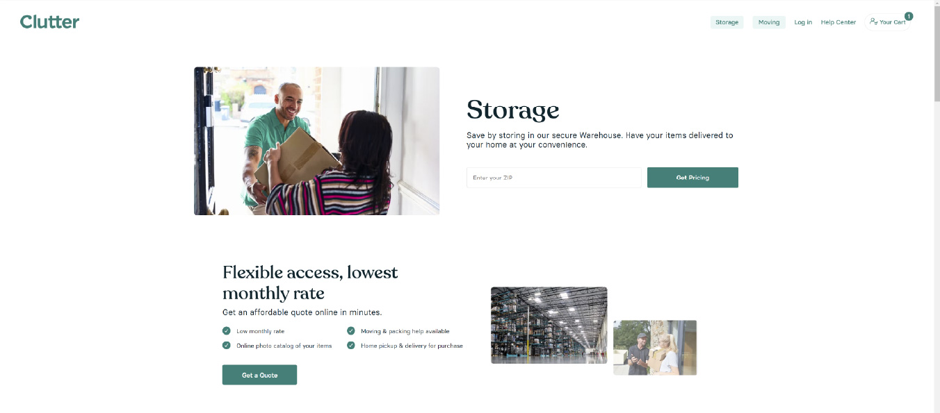
The options to begin a moving/storage quote are housed under different links on the website, which is confusing and unintuitive.
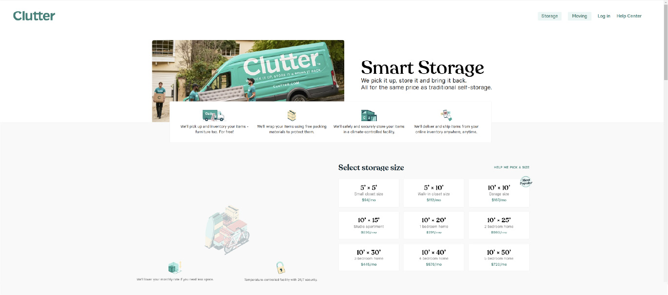
Once a user has entered in their zip code, they are taken to duplicate of the previous page. The user must now begin scrolling vertically to see moving/storage options.
During the current moving and storage selection process, the user is unable to cancel the process at any time. Even if the user stops midway through the process, their contact info and selections are automatically saved to a "cart", and the user is forced to continue where they left off if they return to the site.
Second Major Clutter.com UX Deficiency:
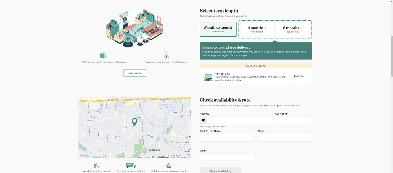
Once a user fills in their information and selects moving/storage options, they're not given a "quote" as text on the website indicates. Instead, the user is taken directly to a booking reservation/payment screen where it's not easy or intuitive for users to go back and make any kind of edits or changes.
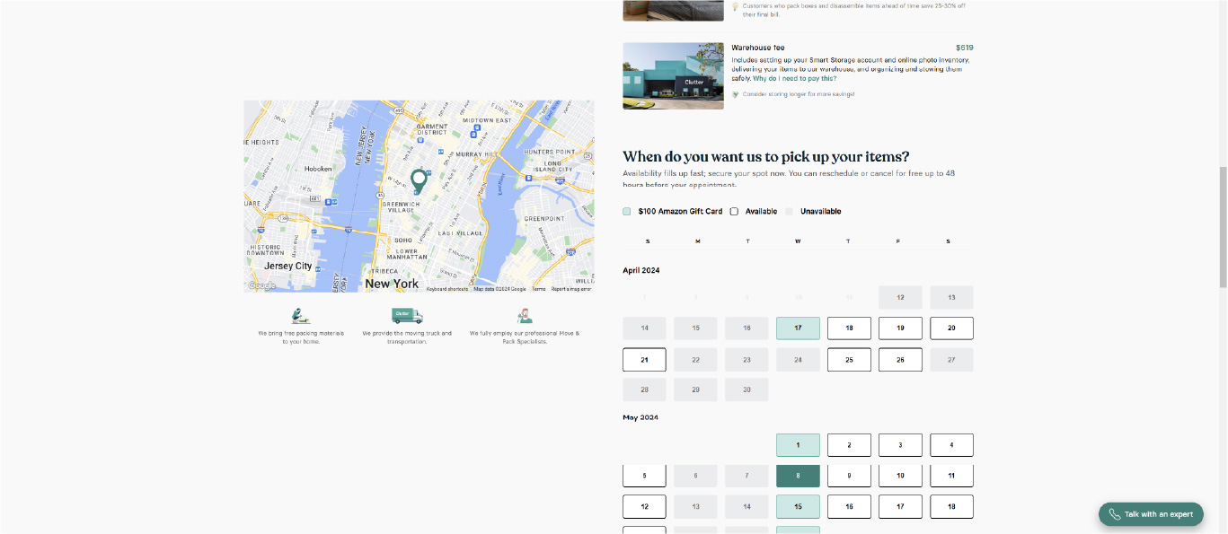
• During the moving/storage option selection process, there's nothing indicating the user's current price for the selected services. Pricing information is only presented at the very end of the service selection process, with the total being displayed in the upper right-hand corner of the website in very small text.
• There's no intuitive way for a user to return to previous steps and add, remove, or change options. The only option for a user to get back to the product selection screen is by clicking the browser's "back" button multiple times. Also, the "cart" feature on this website does not function as expected, and further restricts users from being able to make any adjustments to their preselected moving/storage options.
During the current moving/storage quoting process there's nothing indicating the user's current "total for services." Also, the information on the screen looks cramped and unorganized.
Once a user has finished making their selections for moving, and they want to select services for storage (or vice versa), the user has to click on a separate website link, re-enter their contact info, and start the process all over again. Users should instantly be able to begin a storage process "flow" once they've finished the moving process "flow" (or vice versa).
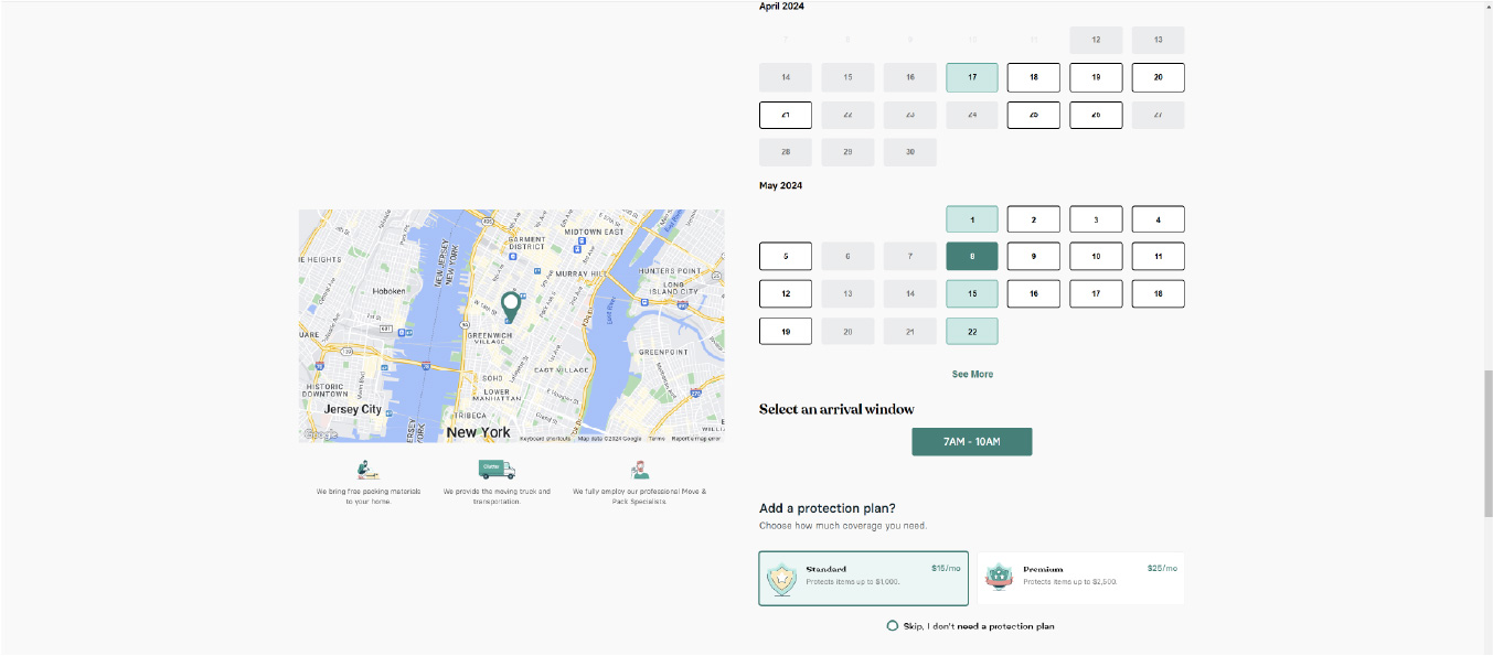
During the current quoting "flow" there's no "steps" to the process, and the user is forced to scroll vertically. There's no "back" button for users to review and edit previous steps.
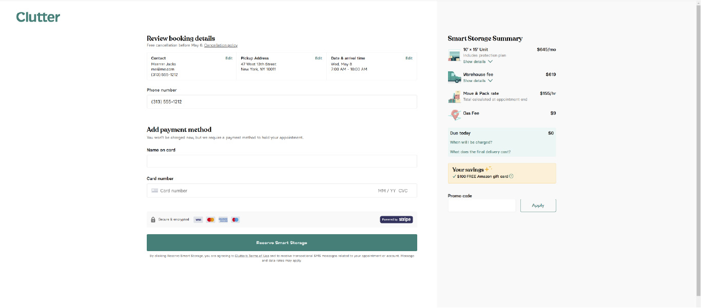
Once a user has finalized all of their selections and added items to the cart, they're taken to a payment screen where there's still no clear and concise "total for services." Additionally, the user is unable to edit or remove items from the cart, and any services already selected are essentially "stuck" in the cart forever. As a user, the only way to clear items from the cart is to delete the website's cookies using the web browser settings.
Create User Personas
Identify two types of users who are most likely to use Clutter’s services.
User personas are user profiles that represent the wants and needs of certain target audience. These personas are an in-depth analysis of certain customer "types" and their behavior patterns, goals, skills, attitudes, problems, and background information. User personas help UX designers identify key themes and thought patterns which enables them to connect with a target audience and make better product design decisions.


Design and Prototype
Develop wireframes that address the issues found on Clutter's website.
Now that I've researched, identified, and documented two major deficiencies affecting Clutter's conversion rates, it's time to begin developing solutions. As with previous stages in the UX case study process, designing and prototyping methods vary from project-to-project. Although interactive Figma prototypes and low/mid/high fidelity mockups could certainly be used, it was decided that simple wireframes with supporting comments would be the best way to approach this stage of the process.
Fixing the First Major Clutter.com UX Deficiency:

Problem: Starting a quote looks more informational than "actionable." Users don't expect to kick off a quoting or purchasing flow by clicking elements in the middle of a web page.
Solution: Adjust the entire website's layout and information architecture to make starting the quoting process more visible, user friendly, and less likely to get lost in the rest of the page.

Problem: The options to begin a moving/storage quote are housed under different links on the website, which is confusing and unintuitive.
Solution: After a user enters in their contact info, offer them three separate options (Moving, Storage, or Both) and walk them through completing each step individually.

Problem: Once a user has entered in their zip code, they are taken to duplicate of the previous page. The user must now begin scrolling vertically to see moving/storage options.
Solution: After clicking the "Get Started" button, the user is taken to a cleanly-designed "contact details" screen, which kicks off the "flow" for the remainder of the purchasing process.

Problem: During the current moving and storage selection process, the user is unable to cancel the process at any time. Even if the user stops midway through the process, their contact info and selections are automatically saved to a "cart", and the user is forced to continue where they left off if they return to the site.
Solution: Add a "Cancel" button to the moving/storage selection process that allows the user to quit at any time and delete any selections made. After confirming the cancellation, the user is taken back to either the "home" page or the last viewed page.
Fixing the Second Major Clutter.com UX Deficiency:

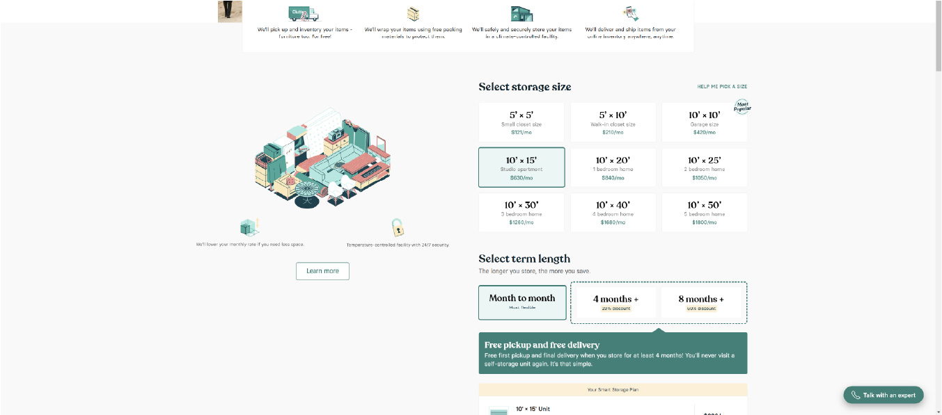
Problem: During the current moving/storage quoting process there's nothing indicating the user's current "total for services." Also, the information on the screen looks cramped and unorganized.
Solution: Add a clearly visible "running total" to the screen, and organize the moving/storage selection options in a clear and user-friendly manner.

Problem: Once a user has finished making their selections for moving, and they want to select services for storage (or vice versa), the user has to click on a separate website link, re-enter their contact info, and start the process all over again. Users should instantly be able to begin a storage process "flow" once they've finished the moving process "flow" (or vice versa).
Solution: Once a user has completed making selections for either moving or storage, they should be prompted to begin making choices for their remaining option (for example, if they chose "Both" on the screen with the Moving | Storage | Both boxes). If the user only chose one service option, they should be asked one final time if additional services are needed, and be presented with a button or a link to kick off that "flow."

Problem: During the current quoting "flow" there's no "steps" to the process, and the user is forced to scroll vertically. There's no "back" button for users to review and edit previous steps.
Solution: The moving/storage selection process is broken down into manageable steps. A "running total" is shown at all times, and the user is able to click on a "back" button, or each numbered step to edit/change options as necessary.

Problem: Once a user has finalized all of their selections and added items to the cart, they're taken to a payment screen where there's still no clear and concise "total for services." Additionally, the user is unable to edit or remove items from the cart, and any services already selected are essentially "stuck" in the cart forever. As a user, the only way to clear items from the cart is to delete the website's cookies using the web browser settings.
Solution: Once items have been added to a user's cart, they can access the cart through the icon in the upper right-hand corner of the site navigation. Users should be able to edit and remove items from their cart at any time, including on the checkout screen.
Present Deliverables & Iterate
Meet with the project team to present, defend, and revise the UX case study.
This could signal the "beginning of the end" for the design process, or a complete revisiting and revising of previous design steps depending on customer feedback. For most projects, revisions and iterations are usually kept to a minimum, because so much time, work, and effort has already been invested to accurately understand and address the customer's specific needs.
Submit Deliverables To Client:
The completed Clutter.com UX case study was shared with the project team within 72 hours as promised. First, a virtual meeting was scheduled with the Clutter team. During this meeting, I shared my screen while I navigated their current website, detailing two main deficiencies that I strongly believed were adversely affecting Clutter's conversion rates. Afterwards, I presented the revised UX designs, giving detailed explanations and justifications behind my UX decisions when questioned.
The Lead Developer, Head of Product, and a Senior-level Developer from Clutter were all present during this meeting. Everyone on the meeting call offered great feedback, were extremely receptive to the suggested UX changes, and eager to carry this new direction over to the live site.
Iterate On Client Feedback:
Almost all of the feedback received from the team at Clutter was very positive, with very few revisions being requested. I recorded a few items the developers stated may pose technical issues for the team, and I was prepared to iterate on those concerns before completing the final designs. Unfortunately, the project was unexpectedly put on hold due to budget constraints, and I was not afforded the opportunity to revise the case study any further.
The Lead Developer suggested that his team was going to use the UX case study screens as-is and try to build-out and implement a revised user experience, but that plan was never completed due to circumstances that I’m unaware of.
Final Summary
A chance to assess project processes, results, and reflect on lessons learned.
This project was somewhat of a challenge given that more than two areas of Clutter.com needs improvement for the site to have a cohesive user experience. After analyzing Clutter.com and comparing the UX to similar websites, it was clear that the process of selecting storage/moving options coupled with an incomplete “shopping cart” implementation were two areas needing the most attention.
Even though I didn't have the opportunity to address the other major UX needs on Clutter.com, I was able to build a solid foundation and provide a blueprint of "fundamentals" for the development team to reference and build from. I expressed to the project team that I’d welcome an opportunity in the future to revisit and address the remaining issues that are hindering Clutter’s website from realizing it’s full potential!
